Showing posts with label print. Show all posts

Wednesday, 15 July 2026

Two-Facebook


I have an admission. I still use Facebook, although it's more out of inertia than anything positive relating to the "experience", which is going from bad to worse.

I've a few friends from the 2010s who I still keep in touch with there.

I've got a "Sickly Cakes" album that I like to update.

I'm in a few groups - writers, ex-colleagues, local busybodies - that it's worth keeping up with.

And I have my books page, The Bother in Burmeon & Chums, which has been bumbling along since 2012 and I see no reason to bring it to a halt.

But I may have to. Last week, after posting the gorgeous retro-ads from Punch 1968 here, I thought I'd put them on Facebook, too. It wasn't long before I was given a good ticking-off:

Your Page, The Bother in Burmeon & Chums, didn't follow the rules, so it isn't being suggested to other people at the moment.

Hi Susan,

Your Page or some of its content didn't follow our Recommendations Guidelines. These guidelines determine what content can be recommended to people. To be eligible for recommendations, either fix these issues or request a review.

I started a wild goose-chase around Facebook and ended up not much the wiser about which particular rules hadn't been followed. This shed a little more light on things, but only a sliver:


No humans seem to have been involved in the decision. I'm certainly not guilty of trying to sell weapons, odd kidneys, body parts of protected species. Or depicting graphic violence or pornography.

The closest I come to "promoting the use of certain regulated products" is that my post featured some rather quaint 58-year-old print ads for cigs, booze and razor blades. 

Ho hum.

And I would have forgotten all about it by the next morning had I not received a slew of pushy messages prompting me to make an ad out of the offending post:


Oh, good grief, I thought.

It's rather like those telecoms companies where they're banging on about purpose and sustainability on the one hand and trying to get you to upgrade your tariff with more and more super-mega-giga data volume on the other. 

Maybe it's no wonder that I'm at my happiest living in the past.


Wednesday, 8 July 2026

RETROWURST: Wizard ads, old boy (March 1968)


Chocks away and time for a swift flypast of the world of print advertising in the 1960s. Some of my earliest memories of advertising trace back to this era. I've had a delightful trip down memory lane in the pages of Punch, the RAF Fiftieth Birthday Number, dated 13th March 1968.

I'll start with the two best-placed (and most expensive) ads. Back cover and inside front cover. These were the pole positions back in those days. And it's no surprise that they're occupied by two of the brands most associated with pilots and derring-do:


I love the sheer heroic aplomb of these ads. There's a supreme confidence about them, a simple assuredness, rather reflecting the character of the (idealised) target audience.

The colour ads in the body of the magazine are a little more subtle. The reader has to be momentarily distracted from the cartoons and articles and find something intriguing enough to look further. Here are two booze brands - Martini and Guinness:


The advertising spans the expected categories - ciggies, booze, clothes, cars, travel, banking - with brands such as Senior Service, Glenfarclas, Courage, Wolseley, Church's Shoes, Trevira, Lombard Banking, TAP Airlines, Pure New Wool/Woolmark and High Speed Gas (remember that?)

And there were job ads, too. I expect this wasn't designed to be an interactive ad, and it's probably as well I didn't pursue a career in Art Direction:


Punch, like many of the brands featured, died with the 20th century. 

But there's a useful archive here , should you want to see what raised a chuckle or two in the days when pilots weren't on automatic.

Monday, 14 December 2020

What's Swedish for Goodbye?


Last week, it was announced, amid much over-use of the word "iconic", that the IKEA Catalogue was going into retirement after 70 years' sterling service. I thought I'd take the opportunity to dig out my collection which probably isn't quite iconic, but does span four decades - and sits in an IKEA box upstairs in my IKEA-furnished office.

The first catalogue I have is from 1990:


This pre-dates my arrival in Germany, but I saw plenty of the black, deep blue and purple look for interiors in my first few years here. Check out this black leathery office:


The first catalogue that came legitimately into my postbox (I suspect I saved the 1990 deep blue horror from a clear-out at the IKEA offices at some point) was the 1997 edition - still in DM, note.


 Many items from this catalogue featured in my first flat here in Germany - and some survive, handed down to my son, who set up his first flat a year ago. Think they call that "circular economy" these days. The catalogue also featured what I think was the first PS Collection:


Bauhaus, eat your heart out! Moving into the 21st century, and the year we set up house - 2004:


I bought several items from this Kingdom of Children collection - note: no pink Princesses:


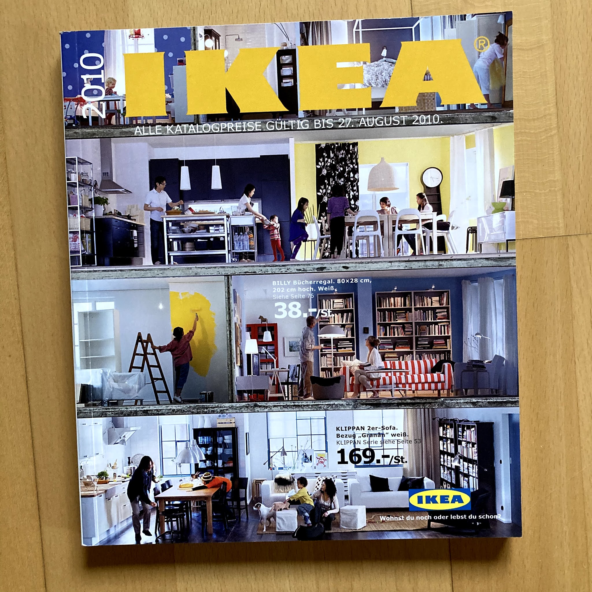
In 2010, the catalogue shrank a little in overall dimensions, but the cover took an expansive approach:


Which brings me to the latest example I have - behind the times as ever, I only have the 2020 edition, not the very last one:


I am sure there will be people who will be pleased to see the back of the IKEA catalogue. Well, here you are. Note the LACK table's decrease in price from 1997 (DM) to 2007 to 2010. 

As they say in Sweden:

 Hej då!