Showing posts with label symbols. Show all posts

Thursday, 16 February 2023

The new Caroleans


I’m skulking around my country of birth at the moment - nothing exciting, dealing with the aftermath of a burst pipe. These visits satisfy - to some extent - my yearning for home, and a simpler place and time. Although again and again, I’m reminded that it’s probably a yearning for something that never really existed, except in my mind.

I was here for Queens Elizabeth II’s funeral last year, but it looks like I won’t make the coronation in May as musical commitments call. However, it was nice to be here as the emblem (not logo) for the coronation was announced (not launched or - heaven forbid! - “dropped”). It’s rather lovely and rather charming, with the rose, thistle, daffodil and shamrock reflecting the King’s love of nature. The designer describes it as “gentle” and that hits the spot.

It’s infinitely better than some of the ghastly Olympics logos we’ve seen - and I suppose at least it doesn’t look as if His Majesty picked it up at Fiverr or 99Designs.

But. Part of me remembers a past when Britain was brave and bold and forward-looking, at least in design terms. It happened long before I was born, but the Festival of Britain posters and style is something that has always been at the back of my mind when I think of the start - and promise - of  the New Elizabethan age.

And I make no excuses for linking to this for all design fans to revel in. Perfection.  

Wednesday, 4 December 2019

How green was my valley?

In the last few weeks, I have noticed crosses by the side of fields while driving. The first couple, I probably didn't register - assuming they were shrines put up at the site of road accidents. But then I noticed something unusual - the crosses were green.

While walking the other day, I came across (ha, ha!) one by a local field, and attached to it was a notice addressed to walkers:

This campaign - Grüne Kreuz - is a "silent protest" from German farmers to lobby the government and powers-that-be to respect their work. It's about everything from dumping prices at the supermarkets, importing cheap goods and giving in to public pressure (maybe too hastily) on environmental protection issues, such as the use of fertiliser and pesticides.

The protest took on a new angle last week when thousands of farmers (and tractors) descended on Berlin. That, I expect, wasn't so silent.

Whatever your views on the issues regarding agriculture and the environment, this does strike me as a masterstroke in terms of campaigning. Using fields as a medium for the campaign and a symbol that immediately evokes interest. The mainstream press tends to be one-sided on this topic and I know I've heard a lot more in the last year about saving bees than I have about farmers' livelihoods.

Farmers for Future, perhaps?


Wednesday, 16 August 2017

From Brand Image to Brand = Image

I've got to the stage in my career where I expect there are far more planners who have come after me than have come before me. But one planner who came before me and is still active thinking, writing, strategising and planning is Paul Feldwick. Paul was one of the early BMP Planners in the 1970s and worked for BMP/DDB right up until 2005. I can thoroughly recommend his books and articles to young and not-so-young planners: they are classics. I still refer to What is Brand Equity Anyway? and much enjoyed Paul's most recent book, The Anatomy of Humbug. Most refreshing and intelligent after all those 25 Secrets Of Highly Successful Halfwits And How You Can Join Them business books.

On Paul's website are links to more articles, including one originally published in Admap March 2014, entitled, simply Brand = Image.  This is a provocative title, as 'Brand Image' has become a dirty word - or phrase - for those of us in the industry. Why have something as ethereal as an image when you can have an Experience or a Platform?

Anyway, the article starts with the creation of what was to become the Nike logo, which earned its creator all of $35 initially. The point is made that maybe it's neither necessary nor desirable to start building a brand from a 'brand essence' definition in words. Many brands start with a visual image, which becomes imbued with meaning via the stakeholders of that brand.

Why does this work? Let me drag out my ancient copy of Man and his Symbols (see illustration above.) In this, Carl Jung states:

What we call a symbol is a term, name or even a picture that may be familiar in daily life, yet that possesses specific connotations in addition to its conventional and obvious meaning. It implies something vague, unknown or hidden from us.

Many brand symbols or logos seem to arise by chance - Paul Feldwick cites the Dulux Dog and the Andrex Puppy - rather than via a conscious process. Chance, yes, but intuition and serendipity also play a role. I have written about a couple of my favourite brand symbols here and here.

Paul talks about the strength of images: they are polyvalent, meaning they carry a multitude of meaning.

I wonder, especially in this global world, whether brands would do better to find a 'one symbol equity' rather than a 'one word equity.'

Thursday, 29 June 2017

Logo to Go

The Michelin Man, Bibendum, has to be one of my favourite brand characters. So I've been slightly wary in the last couple of weeks on hearing that the Michelin Man has been 'slimmed down' and made 'more in tune with the 21st century.' But I think all the cries of 'pandering to the pc-police' aren't warranted. The new-look Michelin Man, above, is his jolly, friendly, dynamic self and would still probably command a BMI above 25. In fact, I welcome the return to a 2-D look - far more classic and adaptable than its 3-D predecessor.

The Michelin Man was conceived by the Michelin brothers Andre and Edouard in the 1890s, who remarked, on seeing a pile of tyres: Look, with arms it would be a man.

The famous poster that launched Bibendum's career was illustrated by the cartoonist Marius Rossillon, aka O'Galop. Here is some more of his work for Michelin:


I love the style of some of the early posters, even if some of Bibendum's accessories might be deemed 'inappropriate' today.


Quite the ladies' man - and look at those shapely calves!


Don't drink/smoke and drive? Ah, well.


You can have my spare tyre?


Spot the Beau Geste influence. Or was it The Desert Song?


Ton-up tyreman? No helmet necessary.

And he's still popular today with the meme set.

Maybe all this goes to show that sometimes random, intuitive thoughts ("...it would be a man") lead to better longevity for company logos and mascots than painstaking definition of brand values, essences and character traits and the careful construction of brand models.

Bibendum is a character that has taken his company from bike tyres to the 21st century 'mobility' market. I'll leave you with a picture of him and some of his advertising chums having a bit of a shindig on the London Underground.


Friday, 9 June 2017

Imitation is the sincerest form of flattery

Passing off and faking usually involves a one-way traffic: downwards on the price scale. But a month ago - or so - an amusing story made a bit of buzz on social media as the designer Balenciaga brought out a tote bag costing around $2,000 that appeared remarkably similar to the famous IKEA FRAKTA blue bag which costs, well, about a two thousandth of that.

IKEA responded in typical IKEA style - see above. This response has all the IKEA hallmarks - a quirky sense of humour and a matter-of-fact pride about the product - and its low price.

The story could have stopped there, but it didn't. It could well have been IKEA's participation that fuelled a whole host of hacks, some of which are more fun and comfortable-looking than others. You'll see what I mean if you click here.

And the great thing is that IKEA didn't walk away from the party. They stayed, and joined in with the fun. It's difficult to tell which of those ideas come direct from IKEA and which from the outside hackers, and it doesn't matter. IKEA have even made a short how-to film on the subject:


And maybe the FRAKTA bag deserves celebration in its own right, too, as a symbol of what IKEA stands for.  Maybe it should become a film star. It just so happens that IKEA have thought of that too:


Thursday, 21 April 2016

A jolly Happy Birthday!

Celebrations are in full swing back in Blighty for The Queen's 90th birthday, and I will no doubt join in. But I also want to celebrate a different birthday, for another (excuse the 'i-word') icon. Not a lady, this time, but a rather fine gent.

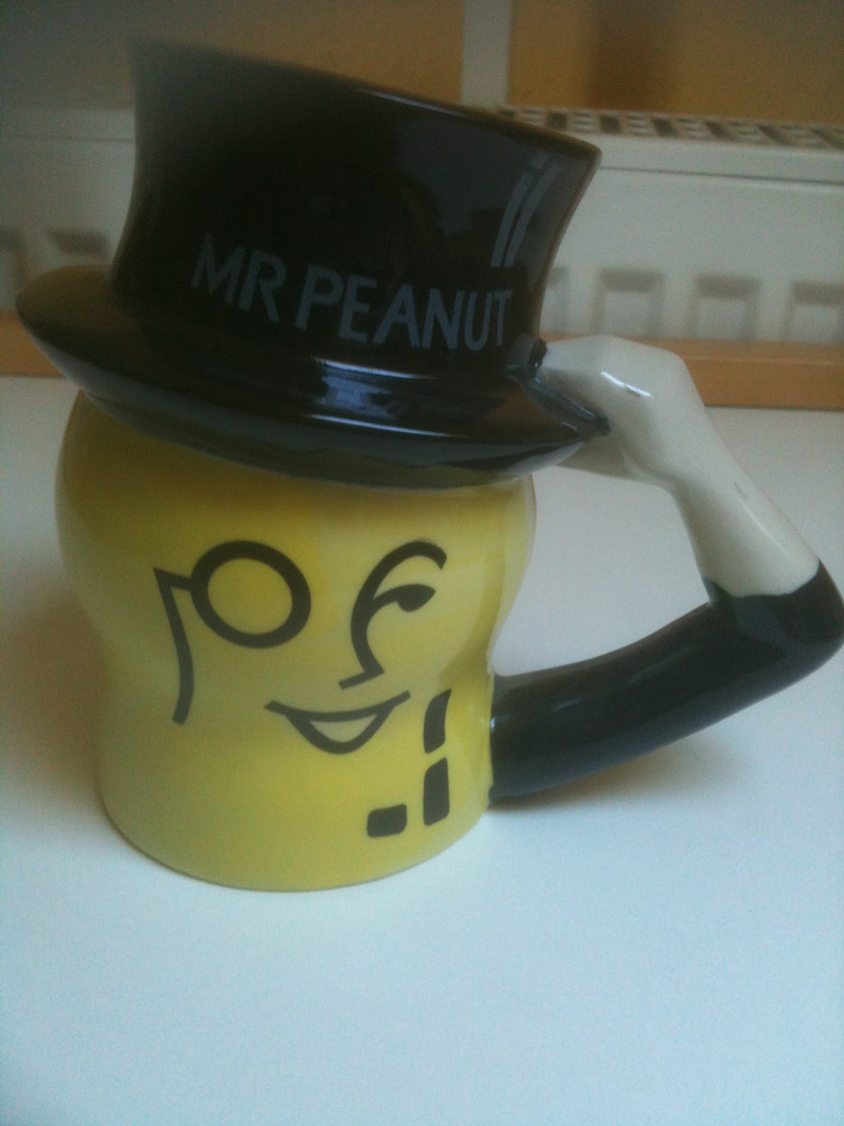
Mr Peanut, of Planter's fame, is 100 years old and celebrated his birthday officially two days ago.

Mr Peanut is one of my favourite brand characters, along with the Michelin man. Not many brand characters reach 100 without being deemed un-PC, too fat, too skinny, the wrong colour, inappropriate or - shock horror - offensive.

Although one or two of Mr Peanut's incarnations are laughable rather than endearing (I am looking at the first NUTmobile here), his longevity surely relies on his staying the sophisticated, nutty gent who promises great quality peanuts. Monocles and spats never go out of fashion.


I'm not sure what year my Mr Peanut mug dates from, but it could as well have been made yesterday.

The history of Mr Peanut is fascinating. In an early example of crowd-sourcing, the original sketches won a competition for 13-year-old Antonio 'Tony' Gentile. Tony won $5 for his idea, which must have been a fair amount of money for a young teenager in 1916. Here's one of his sketches, and you can see the others and read more here.
There's a rather sad end to Tony's story. He didn't go into the world of Madison Avenue, but qualified in medicine and became a surgeon. He died of a heart attack at the tragically early age of 36.

I do wonder, though, what that young boy would have thought if he'd caught a fast-forward glimpse of his creation in 2016.

Sunday, 3 January 2016

Put a tiger in the bank

Brands have long used symbols from the animal world in their logos, names and advertising. Animals are universal symbols, and can quickly convey a host of easily-understood values or characteristics. From the bears on Hofmeister beer and Fox's Glacier Mints, to the black horse used by Lloyds Bank, the Peugot lion, or the Andrex puppy, animals are used to convey anything from strength to softness, to cleverness.

One of the most popular animals used as a symbol is the tiger. My childhood memories include the famous 'put a tiger in your tank' from Esso and Tony, the Kellogg's Frosties tiger. But sadly, the number of tigers in the wild is now far fewer than in those days, with the numbers left in the low thousands. Tigers are on the brink of extinction.

When I published my children's book The Bother in Burmeon , whose storyline involves rescuing a tiger from a most horrible fate as a tiger skin rug, I decided to donate some  of the royalties to a tiger charity, and chose Tiger Awareness.

I am now very pleased to see a great idea from the Panthera conservation organisation: Tiger Royalty. 
This is one of those ideas that's just so brilliant and spot-on that I'm amazed no-one has thought of it before - royalties for tigers from all the tiger-inspired brands and products that are produced around the world, an artistic rights fee for tigers that goes towards the funding of Panthera's Tigers Forever Program.

As Tony the Frosties tiger would have said - That's Terrrrrific!

Thursday, 20 November 2014

Best use of (negative) space

I have to admit to loving logos. Not all those horrid swooshy ones, or whatever you get from 99designs, but clever, artfully designed logos with an idea - and a meaning. Or several meanings.

There's a wonderful collection of 40 brand logos with hidden messages here (care of oomph! who have a pretty good logo of their own). Some I've seen before, some are new to me. Some are just brilliant, like the Shelter logo with the "h" made into a house - so simple. Or the Baskin Robbins logo with its pink 31 in the middle. Or, seeing as I'm in Germany, the super Kölner Zoo logo above, complete with cathedral using up the negative space.

All good communication, from logos to TV ads, works best when there are layers of meaning for people to discover. These may work at the subconscious level and quite often the creative people involved will be consciously unaware of the symbolism that they have built into the design or ad. This is because most good creative people work with symbols instinctively, without any dreary analysis of the "which stimulus can we throw into this to trigger X response" sort.

But of course those layers of meaning are in the eye of the beholder and it's worth checking that your brand new logo doesn't have too much unintentional undesirable meaning. There are plenty of logos with hidden swastikas or dubious sexual acts to be seen in the internet, too!